How to build a great theme toggle switch
Today, “dark mode” is everywhere. Personally I love to use it wherever I can. This guide shows how to build your own accessible switch to toggle dark and light mode on your own website, and offer your visitors their preference. This website has a switch at the top right corner, which serves as an example.
A great solution ticks the following boxes:
- Using only CSS, apply the default theme based on the setting of the operating system (OS) setting automatically.
- When JavaScript is enabled, progressively enhances by showing a switch to override this default theme, which will be stored for subsequent visits.
- Never shows flashing styles from one theme to another during page load.
Let’s get going
So that’s what we’re after. Our solution depends on the prefers-color-scheme
media query, reflecting the OS setting. Perhaps 10 steps sounds like a lot of
work, but I promise each is small and fun!
If you want to quickly see the final solution, feel free to scroll to the of this page and find how to put it all together.
- The Foundation
- Prepare The Switch
- Add The Switch
- Activate The Switch
- Hide The Switch
- Remember The Switch
- Check The Switch
- Sync The Switch
- Extra: Swapping Stylesheets
- Putting It All Together
The foundation
The stylesheet should contain the theme-related variables and the media query to
override them for the other theme. This way, the stylesheet automatically
responds to changes in the OS setting. Let’s use dark as the default theme,
and override the variables when the OS setting is light:
:root { --bg-color: rgb(42, 42, 42); --font-color: rgb(250, 250, 250);}
@media (prefers-color-scheme: light) { :root { --bg-color: rgb(250, 250, 250); --font-color: rgb(82, 82, 82); }}
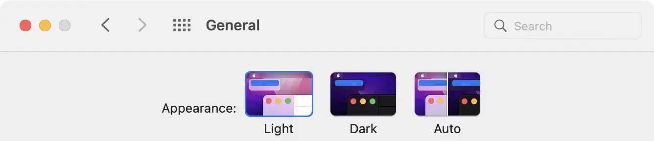
html { background-color: var(--bg-color); color: var(--font-color);}With only CSS, our styles with media queries respond properly to the OS setting. You can see this in action by opening this website and changing the OS setting. In macOS, this can be found in “System Preferences” and then “General”:
Prepare the switch
We are going to need a switch for the user to override the default theme. First,
we need two classes, matching our themes (.dark and .light):
:root,html.dark {  --bg-color: rgb(42, 42, 42);  --font-color: rgb(250, 250, 250);}
@media (prefers-color-scheme: light) {  :root {    --bg-color: rgb(250, 250, 250);    --font-color: rgb(82, 82, 82);  }}
html.light {  --bg-color: rgb(250, 250, 250);  --font-color: rgb(82, 82, 82);}
html {  background-color: var(--bg-color);  color: var(--font-color);}
The styles for the “light” theme, unfortunately, are duplicated. This is
required to override a “dark” OS setting, while the user prefers “light” on this
website. To my knowledge, it is currently not possible to define these variables
only once (e.g. by combining the media query with the html.light selector in
CSS).
Add the switch
The UI element to switch the theme could be as simple or as fancy as you please. Let’s take this website’s switch as an example:
<label class="theme-switch"> <button id="theme-toggle" role="switch" aria-checked="false"></button></label>It could also be a checkbox as it has two states: checked or unchecked. Feel free to borrow the markup and styles from this website’s switch (a slight variation of what’s in this article), or find your own. There’s plenty of great looking switches out there.
Activate the switch
When the user switches the toggle, the theme should follow suit. Let’s make this happen by adding an event listener to our input element:
const toggle = document.querySelector('#theme-toggle');const classList = document.documentElement.classList;
toggle.addEventListener('click', () => {  const isChecked = toggle.getAttribute('aria-checked') !== 'true';  const theme = isChecked ? 'light' : 'dark';  classList.remove(toggle.checked ? 'dark' : 'light');  classList.add(theme);  toggle.setAttribute('aria-checked', isChecked);});
This will swap the light and dark classes on the <html> tag when the user
uses the <input> element. This will set the values of the corresponding CSS
variables, effectively applying the theme. Now we have a functional theme
switch! Yet there’s a few more things we can do to make it even better.
Hide the switch
Without JavaScript, the switch can’t do anything. So let’s hide the switch, and only show it when JavaScript is enabled:
.theme-switch {  display: none;}
.js .theme-switch {  display: flex;}
We can inform CSS that JavaScript is enabled with only one line of JavaScript:
document.documentElement.classList.add('js');Remember the switch
Using the switch, visitors can override the default theme. To also remember this
setting for returning visitors, we can use JavaScript and localStorage. Let’s
write the theme value to localStorage when the user toggles the switch:
toggle.addEventListener('click', () => { localStorage.setItem('theme', toggle.checked ? 'light' : 'dark');});When the user comes back to visit your website later, we can read from
localStorage and apply the theme by adding it as a class to the <html>
element:
const theme = localStorage.getItem('theme');if (theme) document.documentElement.classList.add(theme);Ideally, we place this as an inline <script> tag just before the stylesheets
containing the theme variables. This will make sure we will not see a flash of
styling changes when the theme in localStorage does not match the user’s OS
theme setting.
Check the switch
Now, we have a remaining issue. Since the <input> is initially unchecked, it
may initially not match the OS setting. So we need to check the checkbox to keep
things in check:
const prefersLight = matchMedia('(prefers-color-scheme: light)');const classList = document.documentElement.classList;if (prefersLight.matches || classList.contains('light')) { document.querySelector('#theme-switch').checked = true;}This script is ideally executed before showing the switch, so before adding the
js class to the <html> element.
Sync the switch
A fancy feature is to also sync the switch when the OS setting is changed. We
can listen to changes to the media query, and switch the toggle, unless the
theme was explicitly overridden and stored in localStorage:
const toggle = document.querySelector('#theme-switch');const preferDark = window.matchMedia('(prefers-color-scheme: dark)');preferDark.addEventListener('change', event => { if (!localStorage.getItem('theme')) { toggle.checked = !event.matches; }});You can see this in action by changing the OS setting, and find the theme and the switch have been toggled accordingly.
Extra: swapping stylesheets
In addition to applying theme styles based on media queries or classes, we can
also swap entire stylesheets to match the theme. This website swaps the
stylesheet related to syntax highlighting. There are multiple ways to achieve
this. We can extend the event listener from above, and find the related
stylesheet element to update its href:
const highlightSheet = document.querySelector('link[href*=hljs]');const highlightSheets = {  light: '/css/hljs.github.min.css',  dark: '/css/hljs.github-dark-dimmed.min.css',};
toggle.addEventListener('click', () => {  const theme = toggle.checked ? 'light' : 'dark';  if (highlightSheet) highlightSheet.href = highlightSheets[theme];});
Putting it all together
Let’s put all the bits and pieces together.
When we look at how the browser executes things, this is what we need:
- Read the
themefromlocalStorageand apply this class to<html> - Load the stylesheet containing the media query and CSS variables
- Render a hidden toggle switch
- Load the JavaScript containing:
- Event handler for toggle switches
- Event handler for OS setting changes
- Toggle the switch to match the theme initially
- Show the switch by adding the
jsclass to<html>
Alternatively, as this page serves as a working example, we can “view source” into these three elements:
- High in the
<head>is an inline<script>tag (to read and apply the storedtheme). - There is a
<link>to stylesheet.css containing the styles. - The
<body>has theme-switch.js for the rest of the functionality.
